Project.
Luminor – Pliusų Klubas
Designing a frictionless perks & loyalty platform for a leading Baltic bank.
Client
pliusuklubas.lt
Industry
Fintech & Customer Loyalty
Timeline
1 Month
My Role
UI/UX Design & Wireframing
01.
Context & The Challenge
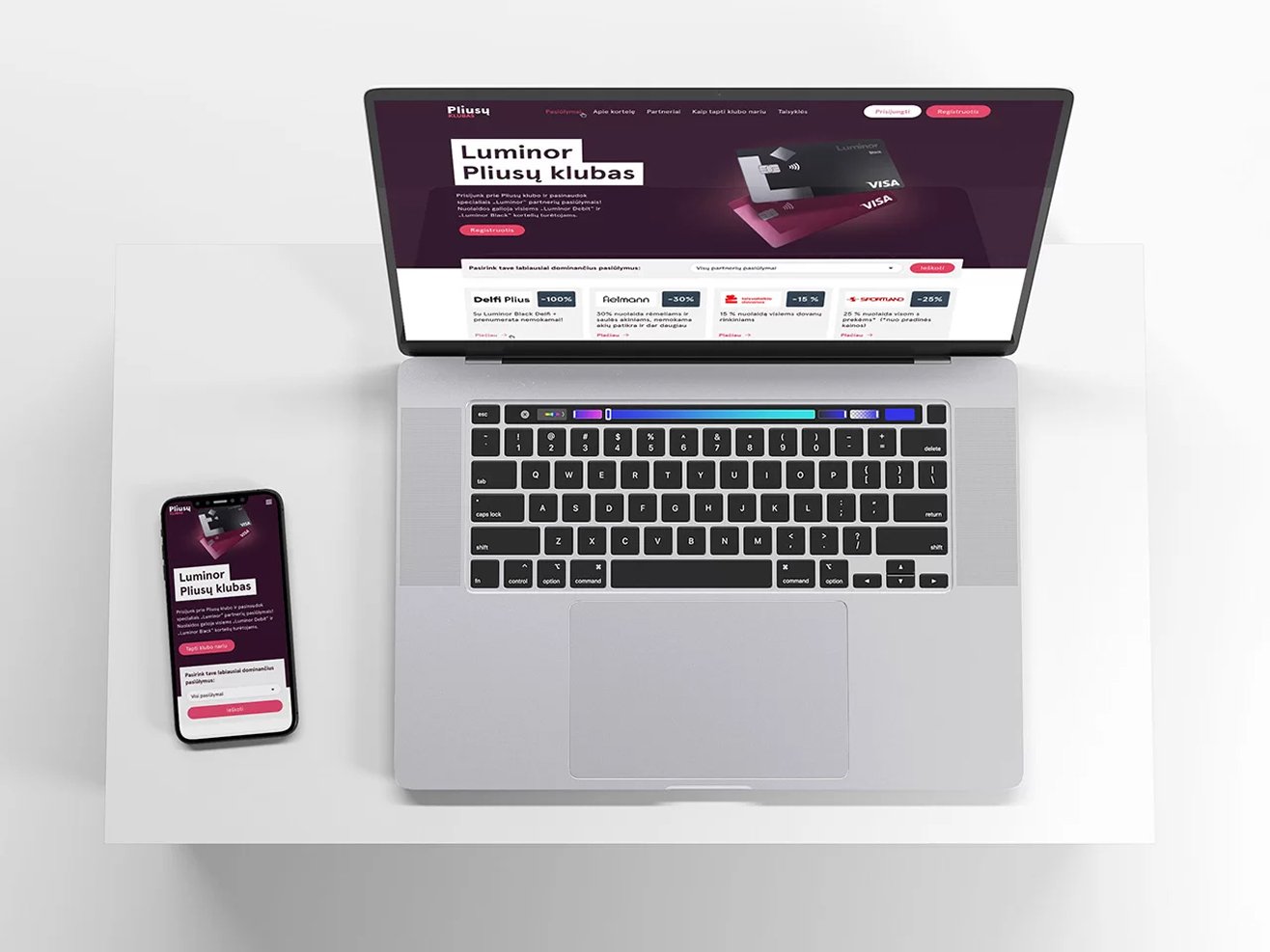
Luminor Bank (one of the top financial institutions in the Baltics) runs “Pliusų Klubas” – a dedicated loyalty ecosystem offering exclusive discounts, perks, and premium partnerships for its cardholders. The core objective was to launch a high-converting, heavily interactive platform that clearly presents these lifestyle rewards and accelerates new customer onboarding.
The design challenge carried multiple complex friction points:
- Information Overload: The platform had to host dozens of dynamic retail, wellness, and entertainment offers. Without strong structure, the user would experience instant cognitive overload.
- Complex Segmentation: Perks had to be instantly filterable by lifestyle category (e.g., Sports, Health, Shopping) and physical location/city, matching the user’s immediate context.
- The “Conversion Cohesion”: As a high-impact landing page, the interface had to balance educational rules (card differences, terms) with high-converting interaction loops—including quick user authentication modals and clear pathways on how to open a bank account to unlock the perks.
02.
My Role & Strategy
As the Lead UI/UX Designer, my mission was to strip away the traditional, rigid corporate banking aesthetic and replace it with a vibrant, modern, lifestyle-focused digital product interface.
The UX strategy relied on three core strategic pillars:
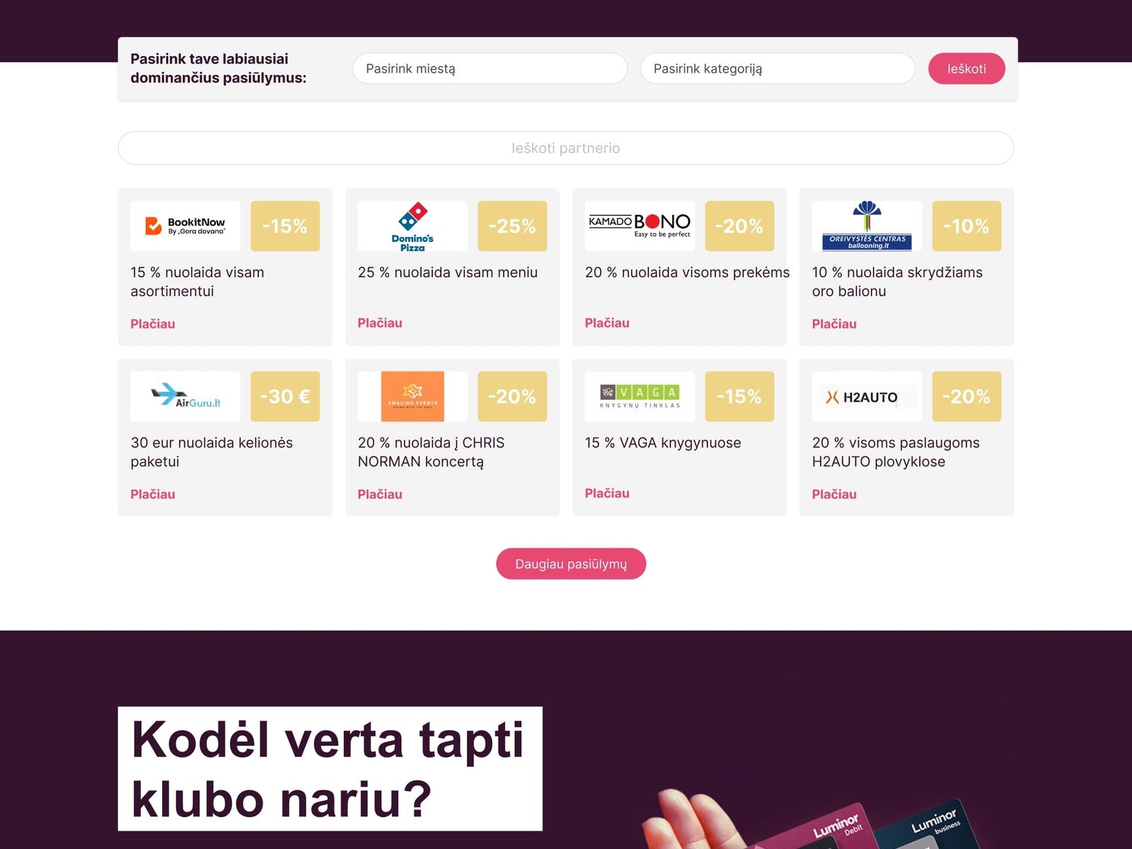
- Frictionless Scannability: Every partner coupon and benefit had to feel like a premium asset. I designed a modular grid system that makes browsing deals as satisfying as scrolling through a curated social feed.
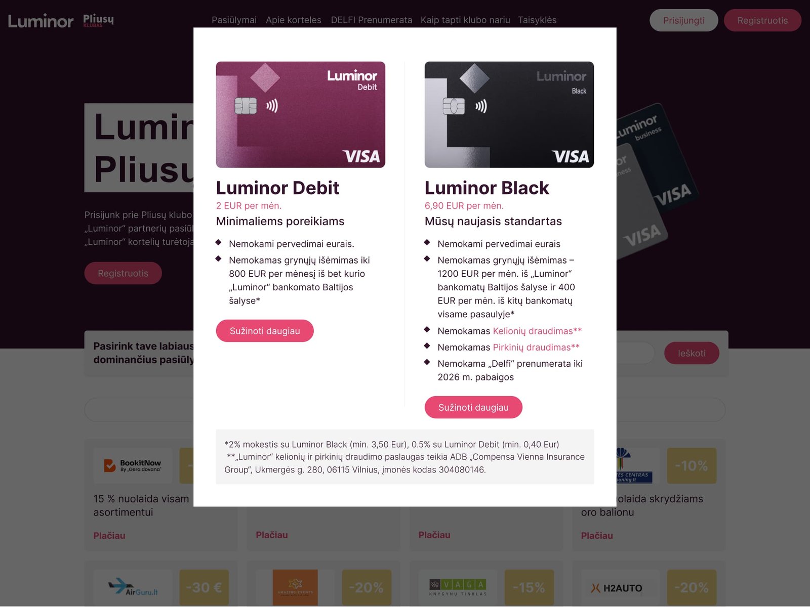
- Instant Accessibility via Modals: To protect the page load speed and maintain absolute focus, we mapped out a dense ecosystem of immersive pop-up modals. Registration, legal terms, card comparisons, and direct coupon terms are completely self-contained within instantaneous modals, keeping the main layout incredibly light and clean.
- The Cross-Brand Catalyst: A massive selling point of the platform was the exclusive co-branding collaboration between Luminor and DELFI (the largest news portal in the Baltics), offering free premium subscriptions. This required a highly visible, native section that felt like an organic extension of the loyalty program.
03.
Design & Execution
- Advanced Dual-Tier Filtering System
We engineered an intuitive, lightning-fast filtering bar at the top of the perks catalog. Users can filter deals by city and category with a single tap. The system instantly updates the cards without refreshing the page, enabling immediate discovery. - Gamified Card Comparison & Onboarding
Instead of boring tables, we designed a highly visual card comparison section. It clearly highlights why upgrading to premium tiers (like Luminor Black) unlocks unmatched value, such as the complimentary DELFI subscription, with direct conversion buttons. - Micro-Interactions & Seamless Coupon Modals
When a user clicks on a discount (e.g., Sportland 20%), the app launches a clean modal window. If the user is unauthenticated, the modal gracefully transitions into a quick login/registration prompt, closing the gap between interest and conversion.
04.
The Results
While focusing strictly on the UI/UX architecture, the launched interface achieved the ultimate strategic product design goals:
- Instant Discovery: Reduced the average time-to-coupon search down to under 5 seconds through the optimized filtering system.
- Zero Navigation Friction: 100% of the auxiliary data (rules, forms, accounts) was successfully condensed into rapid overlays, preventing user bounce rates.
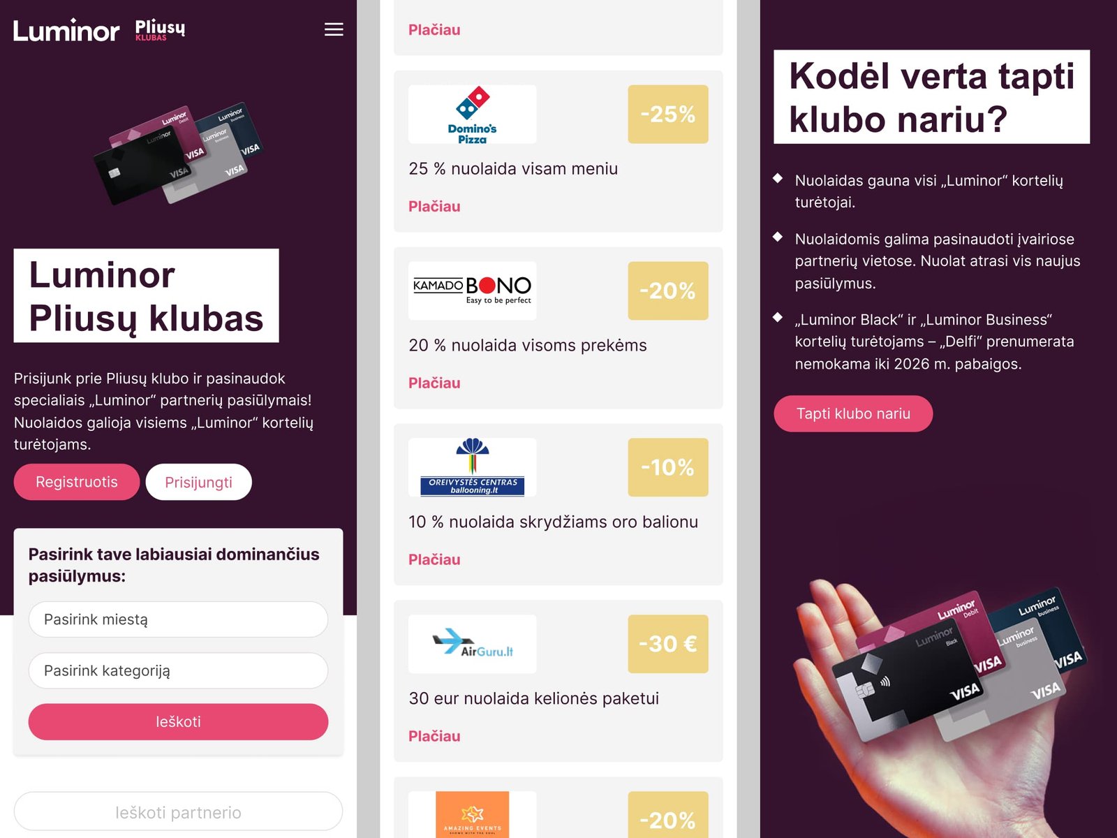
- Premium Brand Elevation: Delivered an app-like, modern web interface that perfectly aligned Luminor’s digital product with modern lifestyle platforms.
Good loyalty design isn’t about making flashy graphics—it’s about designing micro-incentives. By framing bank accounts as “keys to unlock lifestyle savings,” the design shifts the perception of a bank from a utility to a value-added partner. Every element, from the tactile feedback of the filters to the psychological placement of the co-branded DELFI bonus, was meticulously structured to turn a passive browser into an active, loyal cardholder.
See more.