Project.
Gerovės Klinika
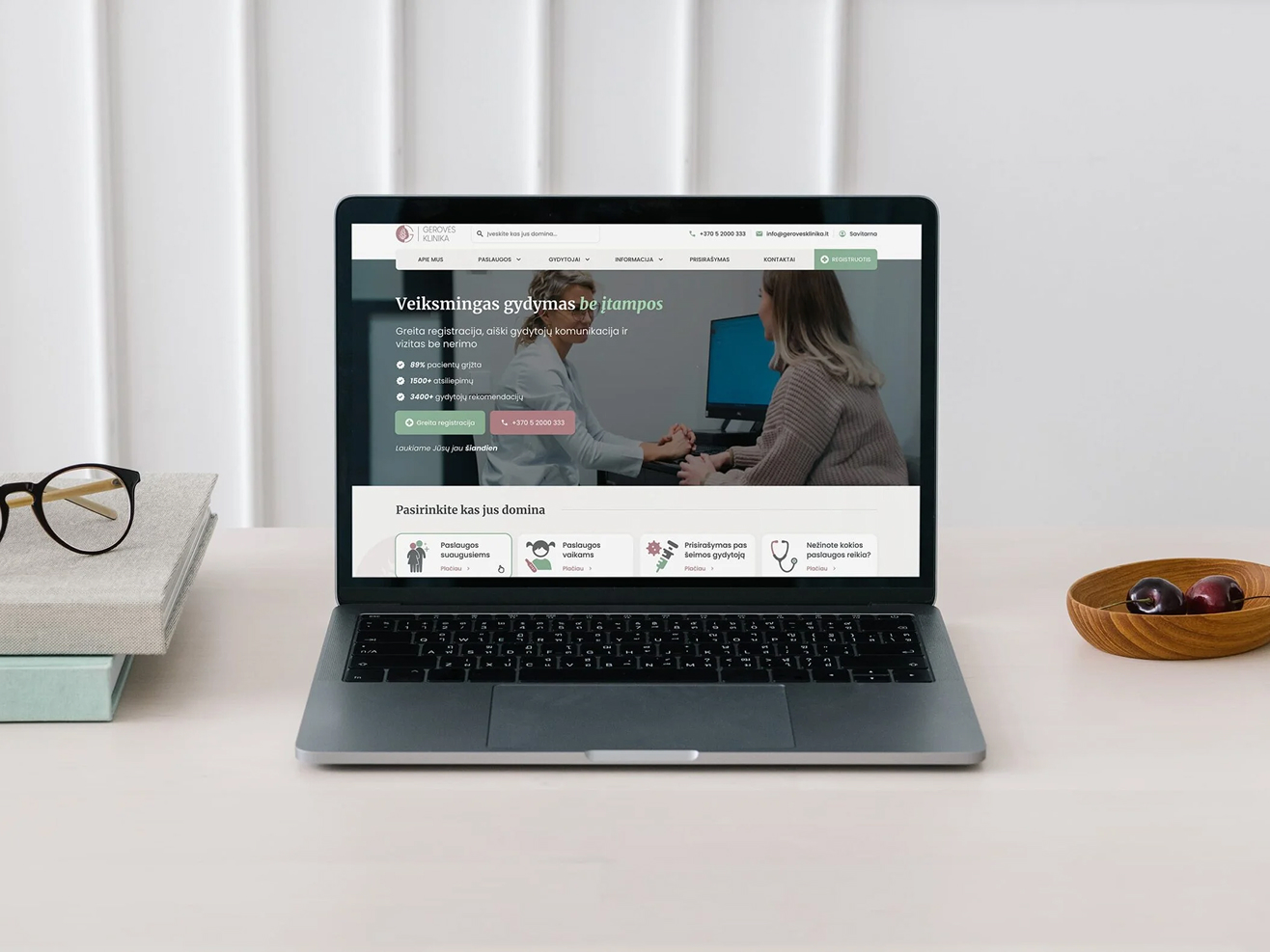
Redesigning the digital patient experience for a premium medical clinic.
Client
gerovesklinika.lt
Industry
Healthcare & E-Health
Timeline
2 Months + Ongoing CRO
My Role
UI/UX Redesign & CRO Strategy
01.
Context & The Challenge
Gerovės Klinika is a fast-growing, premium medical network in Vilnius (with modern branches in Antakalnis and Paupys) built on western values, patient respect, and cutting-edge healthcare. However, their existing digital presence failed to reflect this high-end physical reality and was actively bottlenecking business growth.
The legacy website suffered from critical execution flaws:
- Visual Noise & Poor UI: Outdated aesthetics, cluttered components, and chaotic layouts failed to establish the premium trust required for private healthcare.
- The Mobile Friction: Internal data showed that over 75% of patients accessed the platform via mobile devices while on the go. Yet, the mobile interface was unresponsive, heavy, and frustrating to navigate.
- Booking Drop-offs: The most critical revenue driver – the patient registration funnel – was deeply flawed. Service pages and doctor calendars required too many unnecessary steps, causing massive user drop-offs before appointment completion.
02.
My Role & Strategy
The goal was not just to perform a visual facelift, but to architect a frictionless, high-converting digital portal from the ground up. By combining clean typography, generous whitespace, and strict CRO logic, we transformed the platform into an intuitive digital ecosystem.
- Mobile-First Infrastructure: We re-engineered the entire global navigation and user flows specifically for mobile users, optimizing every button, link, and interactive element for effortless, one-handed thumb interaction.
- Frictionless Booking Ecosystem: We stripped away the cognitive overload from the internal scheduling system. The main registration bar was placed in high-priority visual zones, making the path to booking instant from any page.
- Strategic Trust & Visual Calm: Medical anxiety is real. The new UI leverages a minimalist, clinical yet warm aesthetic. Clear typography, structured hierarchy, and premium physician cards make exploring specialties and choosing a doctor a reassuring, seamless experience.
03.
Design & Execution
- The Revamped Doctor Profile & Interactive Calendar:
Completely re-imagined the internal doctor profile layout. Instead of separating information and scheduling, we integrated a clean, simplified calendar directly into the specialist’s card. Patients can now filter available slots, select a preferred time, and initiate registration in under 3 clicks. - Conversion-Optimized Service Pages:
Legacy text-heavy medical descriptions were replaced with structured, highly readable layouts. Critical information (pricing, treatment steps, and specialist recommendations) is now easily scannable, supported by persistent, contextual “Book Appointment” calls to action. - Seamless Mobile Navigation:
Removed complex multi-level desktop menus on mobile, replacing them with a highly responsive, app-like bottom navigation and custom-tailored overlay filters for instantly finding clinics, doctors, or treatments.

04.
The Results
The visual and structural overhaul yielded immediate, measurable business impact within the first months post-launch:
- +10% to +15% Increase in overall digital patient registrations.
- Significant Reduction in Booking Drop-offs: The simplified calendar flow successfully retained users who previously abandoned the funnel.
- Mobile Conversion Boost: A dramatic increase in completed appointments originating entirely from smartphone devices, validating our mobile-first hypothesis.
Post-Launch & Continuous Optimization:
True UX/CRO work never ends at handoff. To ensure long-term scalability and continuous patient acquisition, our partnership with Gerovės Klinika evolved into a data-driven optimization phase. Following the initial launch, we implemented advanced user tracking and began running ongoing A/B Tests to constantly analyze patient behavior in the booking funnel. By tracking click maps, identifying micro-interactions, and testing alternative button placements or form layouts, we continue to eliminate hidden friction points and maximize the client lifetime value.
See more.