Project.
Zoolu E-commerce Concept
Designing a conversion-focused homepage for a custom phone case platform.
Client
Zoolu
Industry
E-commerce & Consumer Tech
Timeline
1 Week
My Role
UI/UX & E-commerce Strategy
01.
Context & The Challenge
Zoolu is a direct-to-consumer e-commerce brand specializing in customizable, high-protection phone cases. Despite offering vast design options, first-time visitors frequently experience choice paralysis or feel lost when landing on generic customization sites. The goal was to architect a high-converting homepage that immediately clarifies device compatibility, showcases product differentiation, and drives users seamlessly into the customization tool.
The core design objectives and friction points included:
- Device Compatibility Friction: First-time visitors hesitate to explore unless they receive immediate confirmation that their specific phone model is supported.
- Dual User Persona Overwhelm: Balancing two distinct shopping behaviors—hands-on “Creators” who want to design from scratch vs. inspiration “Seekers” who prefer pre-made curated collections.
- Differentiating Quality & Protection: Standing out from low-quality mass-market competitors by clearly communicating protection levels, material durability, and brand credibility early in the funnel.
02.
My Role & Strategy
Serving as the UI/UX Lead on this homepage strategy, I mapped out an information architecture focused on friction reduction, contextual product previews, and transparent education.
- Immediate Navigation Personalization: Integrated an active device selector directly into the main navbar, allowing users to tailor their entire browsing experience from their very first click.
- Dual-Persona Conversion Funnels: Structured the hero and discovery sections to accommodate both direct custom builders and shoppers browsing curated trending themes.
- Transparent Quality Education: Demystified the customization process with a 3-step guide and introduced an early protection tier comparison (Daily Slim vs. Ultra Armor) to build purchasing confidence.
03.
Design & Execution
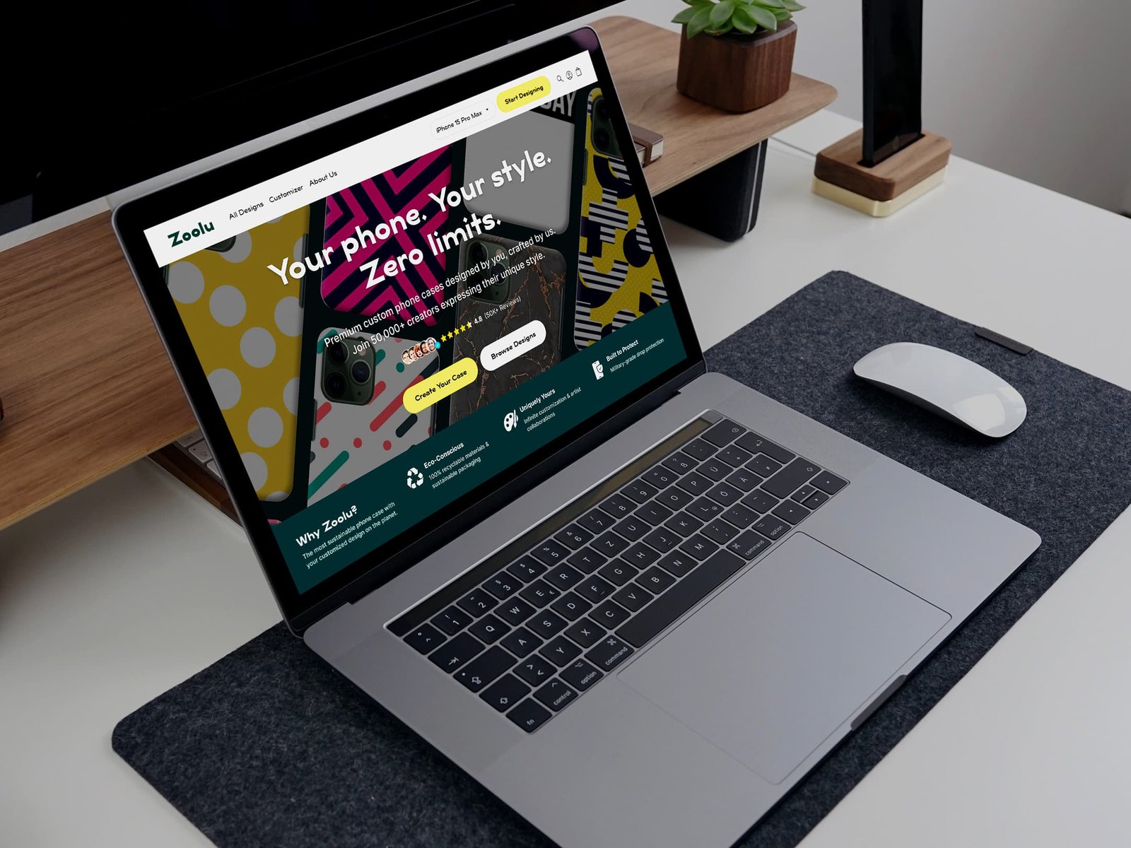
- Navbar Device Selector & Dual-Intent Hero Section
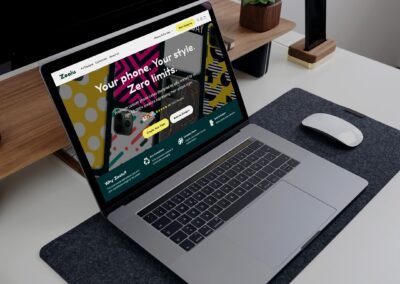
Embedded an instant device selection tool directly within the top navigation bar to confirm phone model support right away. The hero section leverages a strong value proposition (“Your phone. Your style. Zero limits.”), social proof tags (50K+ reviews), and dual call-to-action buttons directing users either to the live customizer or trending collections. - Dynamic Pattern Previews & Curated Discovery
Engineered an interactive collection section where selecting a phone model dynamically updates all pattern thumbnails on the fly. Users can preview exactly how curated designs (Tech, Minimal, Floral) adapt around camera lenses and buttons before entering the product page, backed by a “Design Your Own” fallback card for custom creation. - Protection Tier Education & Social Trust Loop
Created a side-by-side comparison module contrasting “Daily Slim” and “Ultra Armor” tiers to educate users on case functionality early in their journey. This is paired with a live#ZooluStylecommunity gallery and verified customer reviews, establishing brand authority for style-conscious tech enthusiasts.
04.
The Results
The launched UI/UX framework successfully fulfilled the core strategic product goals:
- Eliminated Device Compatibility Friction: Instant navbar filtering reduced user drop-off caused by uncertainty over phone model availability.
- Optimized Multi-Pathway Conversion: The dual CTA architecture successfully guided both hands-on builders and passive browsers into high-intent customization flows.
- Increased Buyer Confidence: Dynamic camera-hole pattern previews and clear protection tier comparisons reduced hesitation prior to entering the customizer.
Design Reflection & Strategic Value:
Designing a successful customization e-commerce homepage requires removing hesitation before the user ever touches a design tool. By combining immediate device recognition, real-time visual previews, and transparent protection tier education, this homepage architecture transforms a potentially overwhelming catalog into an intuitive, high-converting shopping experience.
See more.